Color Studies
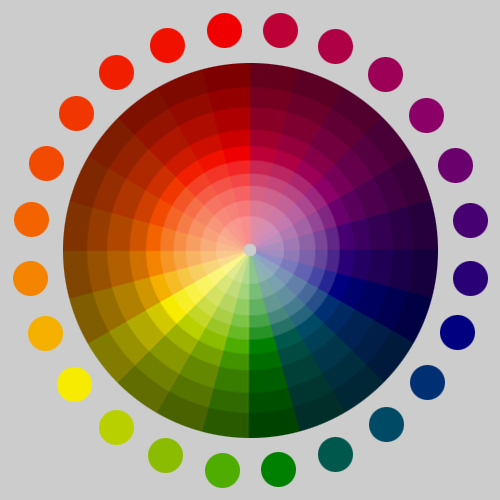
Colors of a complementary relationship.
 Colors of a complementary relationship assigned equal proportion.
  Colors reassigned with proportions allocated to dominant and subdominant areas.
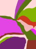
 Color intensity and proportion modified. Using tints and shades of the original colors results in a moderate level of contrast and medium value.
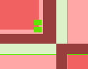
 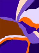 Colors applied to composition.
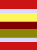
 Color intensity and proportion modified - the whole area displays a moderately-high contrast and medium value.
 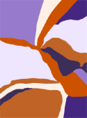 Colors applied to composition.
Colors of a triad relationship.
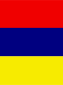 Colors of a triad relationship assigned equal proportion.
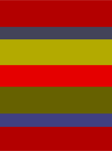
  Colors reassigned with proportions allocated to dominant, subdominant, and accent areas.
 Color intensity and saturation modified - the whole area displays a moderately-high contrast level.
 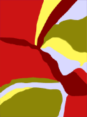 Colors applied to composition.
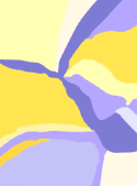
 Color intensity and saturation modified - the whole area displays a moderately low contrast level.
 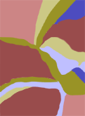 Colors applied to composition.
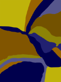
 Color intensity and saturation modified - the whole area displays a medium/dark value.
 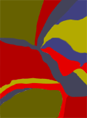 Colors applied to composition.
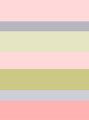 Color intensity and saturation modified - the whole area displays a light value,
 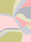 Colors applied to composition.
 Moderately-high contrast, medium value, composition using fully saturated hues.
 High contrast, medium value, composition using shades, tints & various saturation levels.
 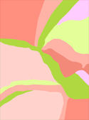 Moderately-low contrast, medium-light value, using tints & various saturation levels.
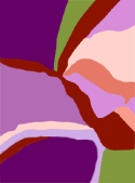 Moderate contrast, medium value, using shades, tints & various saturation levels.
  Moderately-low contrast, medium-dark value, using shades & various saturation levels.
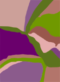 Low contrast, medium value, using shades, tints & various saturation levels.
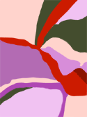 Moderately-high contrast, medium value, using shades, tints & various saturation levels.
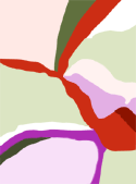


 Dominant color

 Sub-dominant colors
  Accent
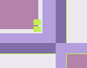
 Dominant color

 Sub-dominant colors
  Accent
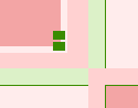
 Dominant color

 Sub-dominant colors
  Accent
 Dominant color

 Sub-dominant colors
  Accent